Apple: Brand Evolution
Apple is a technology company that has profoundly impacted the world. Founded in 1976 by Steve Jobs, Steve Wozniak, and Ronald Wayne, Apple has consistently pushed the boundaries of what is possible with technology and has created a wide range of products and services that have changed how we live and work.
Apple is known for its innovative products, including the Macintosh (Mac), the iPod, the iPhone, and the iPad, which have revolutionized how we communicate, access information, and entertain ourselves. The company has also developed several services, such as the App Store, iCloud, and Apple Pay, which have made it easier for people to connect, share, and transact online.
Apple’s commitment to design, user experience, and quality has made it a leader in the technology industry and helped build a loyal and passionate customer base. Apple has also had a cultural impact, with its products and marketing campaigns becoming symbols of creativity, individuality, and success.
Apple’s brand elements, such as its logo, slogan, and design aesthetic, have evolved over the years as the company has grown and expanded its product line. Throughout its history, Apple has also been known for its focus on simplicity and minimalism in its product design, attention to detail, and use of high-quality materials. These elements have contributed to the company’s brand identity and helped establish it as a leader.
1976
In 1976, Apple was founded, and the original logo for Apple was designed by Ronald Wayne, one of the company’s co-founders. This logo featured a drawing of Isaac Newton sitting under a tree with an apple about to fall on his head. The image was meant to symbolize the discovery of gravity and the idea that Apple was bringing “enlightenment” to the personal computer industry.
1977
In 1977, the original logo was replaced with a rainbow-colored apple designed by Rob Janoff. The rainbow gradient was created using six colors: green, yellow, orange, red, violet, and blue. Rob said there was no rhyme or reason behind the order of the colors. Steve Jobs wanted green at the top “because that’s where the leaf was.”
According to Janoff, the “bite” in the Apple logo was initially implemented to ensure it represents an apple, not a cherry tomato. It also has a wordplay of bite/byte, which works for a technology brand.
The rainbow Apple logo was the primary logo for many years and became one of the world’s most iconic and recognizable. It was used on various products, including the Apple II, Macintosh, and other computer systems. The logo was also featured on Apple’s advertising and marketing materials and became synonymous with the company’s brand.
The rainbow apple logo was eventually replaced with a monochrome apple in 1998. Still, it remains integral to Apple’s history and has been widely recognized as a classic and enduring design.
1984
In 1984, Landor Associates (a leading brand identity firm; today known as Landor & Fitch) turned Rob Janoff’s design into the art it is today by removing the company name from the logo and keeping the remaining apple with a bite. They made the logo more symmetrical and geometric.
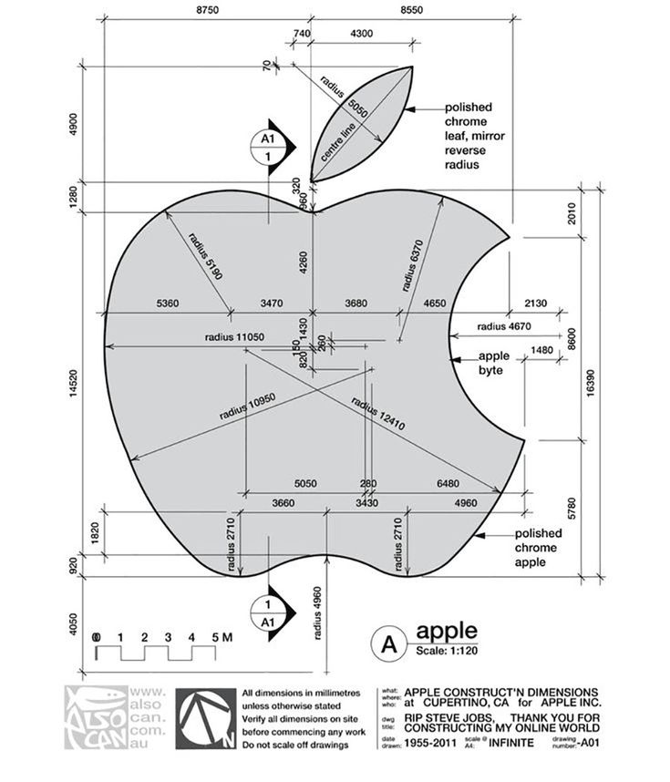
This is one of the rare logos that maintain the golden ratio principle.
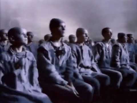
The same year, a new “1984” ad commercial was created by the advertising agency Chiat/Day for Apple Inc. and aired during the 1984 Super Bowl. Ridley Scott directed the ad, based on George Orwell’s novel “1984,” which was a dystopian novel about a future totalitarian society. The ad depicted a group of people in a gray, drab world, following a leader on a large screen, representing the conformity of IBM’s personal computers.
Suddenly, a woman dressed in athletic clothes, representing Apple Macintosh, runs into the room and throws a sledgehammer at the screen, symbolizing the Macintosh’s ability to “think differently” and challenge the status quo. The ad ends with the tagline, “On January 24th, Apple Computer will introduce Macintosh. And you’ll see why 1984 won’t be like “1984” The ad was considered a breakthrough in advertising and is widely considered one of the greatest television commercials of all time.
1977
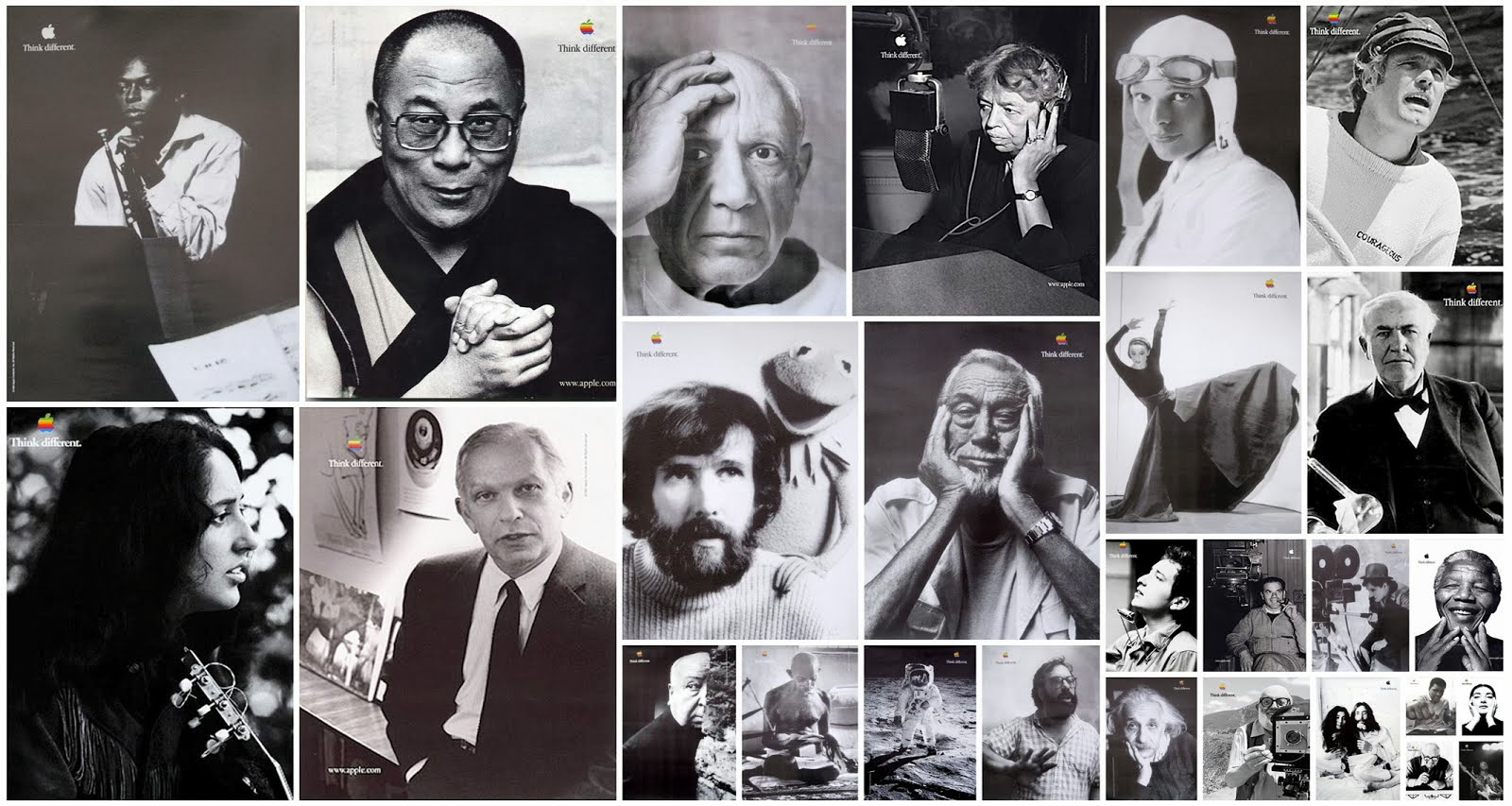
In 1977, Apple introduced the slogan “Think Different” which was used in a series of advertising campaigns that featured iconic figures, including Albert Einstein, Mahatma Gandhi, and Martin Luther King Jr. These campaigns were created by the advertising agency TBWAChiatDaywere with the intent to position Apple as an innovative company that encouraged creativity and individuality.
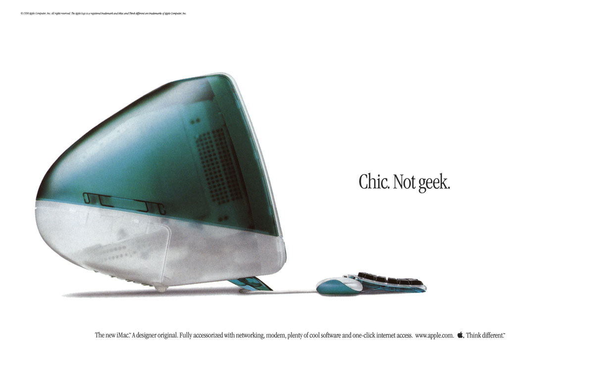
1998
One year after, Jobs rejoined the company after being gone for twelve years. Jobs replaced the rainbow colors and used a new translucent blue logo. It was short-lived as Apple decided to use a solid color logo to complement a metallic casing of their hardware.
As part of the rebranding, the translucent blue logo was replaced with a monochrome design.
The monochrome apple logo featured a stylized apple in a single color, typically black or white. The logo was designed to be more versatile and easier to reproduce, as it could be used on various backgrounds and media without losing its impact.
The monochrome apple logo was used on various products, including the iMac, iPod, and iPhone, and was featured in Apple’s advertising and marketing materials.
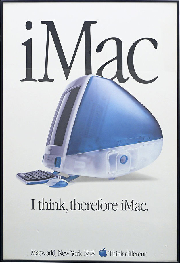
The same year, a new slogan was introduced, “iThink, therefore iMac” to target PC users and encourage them to switch to the Macintosh platform.
2001
In 2001, Apple added more life to its flat monochrome logo with silver gradients and depth. It was created to stand out on any surface.
2006

In 2006, Apple introduced the “Get a Mac” campaign, a series of television commercials created by the advertising agency TBWAMedia Arts Lab between 2006 and 2009. The campaign featured a series of humorous advertisements that compared the features and capabilities of Apple’s Macintosh computers to those of personal computers running Windows.
The ads featured two actors, one playing the role of a hip, laid-back Mac, and the other playing the role of a stuffy, out-of-touch PC. The Mac was portrayed as easy to use and more reliable than the PC, while the PC was shown as prone to problems and requiring constant technical support. The campaign was known for its catchy jingles and its clever use of humor to promote the Mac as the superior choice for personal computing.
2007
The redesigned apple logo was introduced in 2007 and featured a stylized apple with a more three-dimensional appearance. With a depth arch touching from the left side to the right side.
2011
Apple introduced a new campaign, “Yup, if you don’t have an iPhone, well, you don’t have an iPhone.” It highlighted the iPhone’s popularity and ubiquity and positioned it as a must-have device.
2013
The monochrome apple was updated to its current design. The new logo featured a stylized apple with a flat, two-dimensional design and a gradient color effect. The gradient effect was created using two shades of a single color, with the lighter shade on the top and the darker shade on the bottom. The result was a more three-dimensional logo with a more modern and dynamic appearance.
2017
The company reverted to Steve Jobs’ monochromatic color logo. Making chrome stand out on various Apple devices.
In conclusion, the Apple brand has undergone a significant evolution since its inception in the 1970s. From the early days of the Apple I and II computers to the Macintosh and the introduction of the graphical user interface to the current lineup of iPhones, iPads, and Macs, the company has consistently pushed the boundaries of technology and design. Apple’s commitment to innovation and user experience has made it one of the world’s most successful and recognizable brands. The future looks bright for Apple as they continue to introduce new products and services to meet the needs of consumers around the globe.
What do you think about this brand evolution story? Please share your thoughts and suggestions in the comments section below.